If you are interested in worship spaces or involved in discussions about your own place of worship, you will find this article a helpful place to start as it provides categories and language for the conversation that goes beyond what an individual may "like" or "dislike".
Austere. Clean. Simple. Those are qualities we traditionally associate with a Reformed worship environment. The early Reformers, after all, eliminated many of the visual distractions for the simple, direct worship of God.
However, a visually simple environment is becoming more the exception than the rule in many of our churches. That may be due largely to our tendency to add new fixtures to our worship space without much thought as to how they blend with the existing structure and furnishings.
Many of our sanctuaries were built more than a generation ago. Since architects at the turn of the century could not possibly anticipate how we would view worship, the worship space they designed often conflicts with our worship today. For example, sometimes hanging banners in an older sanctuary works against the unity of worship instead of contributing to it. The banners look like an intrusion rather than serving as a meaningful contributor to the worship space.
That raises important questions: How do we evaluate the visual aspects of our worship space? How important is it to adapt our space in response to new theories of worship? Just how important is the space in which we worship?
Fittingness
Before we can answer these questions responsibly, we need to examine the whole issue of what is and is not visually appropriate in our sanctuaries. I call this issue fittingness—the idea that one thing should relate to another thing in an appropriate manner.
In Art and Action (Eerdmans, 1980), Nicholas Wolterstorff describes the idea of "fittingness" as it relates to the aesthetic dimension of what artists do:
Artists are workers in fittingness—all artists, inescapably—not indeed in the sense that their work is made out of fittingness, but rather in the sense that fittingness is a feature of the reality within which we all exist. It is a feature of which we are all aware, artist and non-artist alike... (p. 96).
Wolterstorff goes on to define by example what fittingness is. He says: "Fittingness is cross-modal similarity." And when things are similar, they are similar in respect to something. That something implies a relationship of some kind: similar materials, similar colors, similar patterns, similar understandings. Artists are people who look for these similarities not only within a work of art, but wherever they find it lacking. They are always looking for how this part fits with that part, how this color fits with that color.
Artists work with the elements of design: line, shape, value, texture and color. These elements are their basic tools, and they use them according to the principles of design. Balance, rhythm, harmony, repetition, variation, contrast, simplicity, and focus are the names of popular principles described in most design publications. When we apply some of these design principles to our sanctuaries, we may discover not only what our problems are, but also how to solve them.
Focus
Donald Bruggink's book Christ and Architecture (Eerdmans, 1971) describes, from both a theological and an architectural/aesthetic point of view, the various possibilities for the worship space. He speaks eloquently about the sacraments and what we have done or not done with them visually:
When one enters the church in which the communion table cannot be seen from the pews, there is certainly no visual indication that the sacraments are considered of much importance. Visually, the implication is that they are of no account, whatever the church's real feeling may be. Or, if the table is placed at the foot of the center aisle, on the same level as the pews, covered with the mornings floral display and offering plates, does this really show a great deal of respect for the sacrament? And if many of our Reformed churches have dealt carelessly with the Lords table, what has been the fate of the baptismal font? In almost all cases it can barely be seen in an empty church (let alone when the congregation, is present!), peeping above the backs of the pews, visually insignificant in comparison with the flags, pianos, lectern, organ and choir. If it calls attention to itself at all it is usually by its very ugliness, often rendered in a style and material completely alien to the rest of the church (pp. 125-6).
In my travels, I have had the opportunity to lecture and worship in numerous congregations in North America, and it is my impression that we continue to have a major problem with fittingness. Many of the worship spaces I have seen are a strange collection of different kinds of furniture (even misplaced furniture), curious uses of different kinds of materials, peculiar mixtures of different liturgical elements, and exciting images and banners that often do not fit the total space. In all that clutter it is sometimes difficult to discover what the local congregation really believes.
Traditionally we would expect the pulpit to symbolize the word and its preaching, the baptismal font to symbolize baptism, and the Lord's table to symbolize the celebration of the Lord's Supper. But in the sanctuaries I've visited I've frequently discovered that one, sometimes more, of these symbols was missing or hidden in some manner from prominent view. What we wish to emphasize as a congregation should be reflected in the visual importance we assign to it. So when we begin evaluating our visual environment, we should first ask ourselves what fits with what we believe. Are we emphasizing the right things?
Simplicity
The second principle we should seriously consider is simplicity: Do we need what we have? For example, most churches have introduced the use of the printed order of worship and follow that order without further announcements. Yet some insist that the old Psalm board remain in the sanctuary and that it be used regularly, even if it has become redundant. Simplifying— eliminating un-needed items—is an important way to create order within the sanctuary.
Contrast
The third principle to consider is the use of materials. How many different materials are competing with each other within the worship space—and especially within the liturgical center where we find the pulpit, the Lord's table, and the baptismal font?
Listing these materials to reflect their relative importance is one way to help us prioritize and reorder some of them, so that we can restore some kind of visual order. How busy is the background behind the preacher? Is it difficult to see the minister preaching because the brick pattern behind them is much louder than they clothes they wear? Is it difficult to be reflective in the worship space because of the different materials fighting for attention?
What can we do to adjust these warring elements? First, we must recognize that most churches have a problem in this area. Second, we must identify the problem through recording the number of materials and the degree of intensity of each material. Third, we must look for ways in which we can build bridges between the various materials so they relate better to one another, or consider taking some of them out altogether. The unification of materials can have a very harmonious effect on the entire worship experience.
Repetition
Instead of using a variety of patterns and shapes in the worship space, it makes sense to choose one uniform shape and let that shape echo in various sizes throughout the space. It's obvious that the architects of the ancient cathedrals understood that: the pointed arch unifies the total structure. If the design and the construction of the pulpit, the baptismal font, and the communion table are all the same, the visual cohesiveness will be apparent. A visual fittingness will connect one with the other, allowing the design and placement of each item to dominate. It is fascinating to observe how easy it is for a microphone stand, with all its shiny surfaces, to become more prominent visually than the much larger communion table. Often the little things distract the eye and wrongly get attention.
Harmony
The introduction of color can have a soothing and unifying effect if the color begins to dominate the entire space. If different wood materials are used, refinishing all the wood surfaces into one uniform finish will be visually unifying. The color of the carpet, the pews, and the walls can help to contrast or unify the sanctuary and create a total harmony.
In this, as in other areas, however, careful thought and planning is essential. If color is introduced in a "halfhearted" or minor way it can easily become yet another distracting element in the sanctuary.
Balance
Balance is one of the principles of ordering things. Many congregations disrupt the balance in their worship space by mixing formal and informal elements. Combining these two styles sends mixed signals, which often results in a lack of visual order.
Balance can be formal or informal, although an evenly balanced worship space tends to be more formal than when things vary a great deal. A congregation may choose either formal or informal balance within their worship space but, by definition, they cannot choose both.
A Place to Worship
The worship space in which we come together weekly is important to us worshipers, for we have come to worship the God of the universe, the God of our salvation, the God who will return to judge the living and the dead. That space has an affect on us when we enter; it should encourage us to worship, to meditate, to praise.
Preparing the worship space for worship should be the responsibility of those who prepare the order of worship. Order is not just the logistics of what happens when, it is also the order of how worship elements fit with one another—that should include the fittingness of the sanctuary for worship.
In this church interior a number of factors are working against each other.
The chairs are of one design, black and white and made of steel tubes; the Lord's table and the pulpit are more traditional wood furniture; the baptismal font is placed just behind a microphone and a music stand and is of yet a different, more contemporary design.
There is an array of contrasting colors—a red banner proclaims in words: "Nations Will Come to Your Light," while over the pulpit hangs a light blue banner with a golden cross.
An open Bible sits on the Lord's table, confusing Word and sacrament.
An overhead projector becomes more interesting than the pulpit on the platform.
The placement of the plastic flowers could be called random.
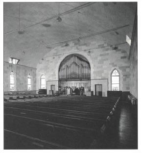
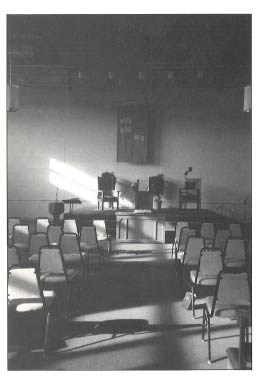
The focus of this church is the liturgical center, which is defined by some furniture-like partitions. Within this center you find the pulpit in the middle, the Lord's table in a somewhat less prominent position on the floor, and the baptismal font next to it, almost hidden by the pews. There are two large, very interesting pots of flowers on very high stands; three massive chairs; and a large, visually dominating organ. The brick wall has an interesting yet subtle pattern. Overall there are many things to look at here; however, the space provides few visual cues as to this congregation's worship priorities.
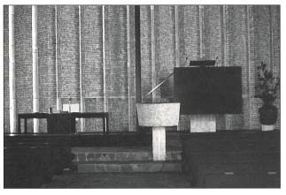
This interior display a good example of informal balance. The pulpit remains dominant because of its size .The baptismal font is, however, the first thing you encounter when you look ahead. We all come into the church through baptism, and it is therefore fitting in this context. The Lord's table is larger than the font but less massive in appearance.
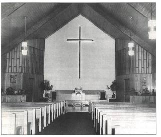
This interior clearly indicates what we should focus on: both the Lord's table and the pulpit are central. The place of the baptismal font is less clear; it can be seen just off to the side. Placing the large chairs on the side helps, but since the upholstery is a bright red, I can't help but notice them; soon my eyes are playing a ping-pong match between the two. The cross against a clean back wall works as a dominant image. This image remains strong against the busy pattern of the woodwork on the sides. The floral/plant boxes are integrated with the wooden walls and work better there than the palm-like plants on the platforms.
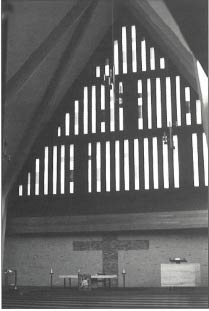
Entering this sanctuary is a unique visual experience. Immediately you can see all of the visual reminders of the three sacraments. On the side is the light-colored pulpit; in the center is the Lord's table, and next to it stands the baptismal font. But once you enter, the entire space opens up, inviting you to worship and to be affected by the uplifting quality of the windows.