In this article Chris Stoffel Overvoorde (1934—2019), who was a professor of art at Calvin College and a member of Grace Church in Grand Rapids, Michigan, explains how his congregation developed a meaningful environment for worship. The congregation, which began as a mission chapel in 1949, has grown into a multicultural congregation of roughly one hundred families. Through the use of a church symbol, banners, liturgical color, and sculpture they have created a worshipful and meditative liturgical environment.
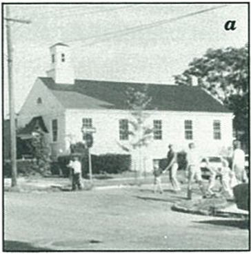
When Grace Church worshiped in the structure now called "The Henry Washington Memorial Chapel," it met in a traditional environment. The pulpit, baptismal font, and communion table were placed in front, facing straight rows of non-movable seats. Although such an arrangement is secure (the congregation knows exactly where everything is and what to expect), it had disadvantages for a congregation like Grace. Everything always looked the same. As far as the environment went, it was difficult to differentiate between Lent and Easter, Advent and Christmas.
As the congregation grew, the need for an identity arose. How did we think about ourselves? What was the focus of our communal lives as Christians? The name "Grace Church" was certainly more meaningful than the "Anywhere Street Church." But in what other ways could we express who we were?

We did a lot of talking about our identity. We wrote original liturgies, songs, and special music—all of which reflected something of who we were as a congregation. And we also came up with a visual image for Grace Church: we adopted a crown of thorns as a symbol of Christ's suffering, a triangle to represent the Trinity, and a dove to remind us of the Spirit that dwelled among us. This visual reminder of God's grace to us quickly became meaningful to members of our congregation. It appeared on our letterheads, on bulletin covers, on banners, and on a pulpit hanging. It also opened the door for other visual expression.
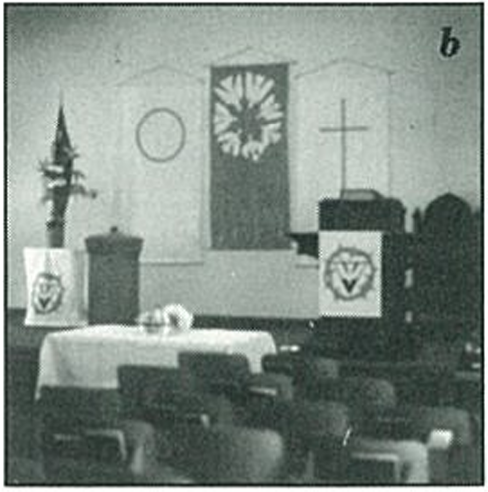
The worship committee began looking for visual ways in which to highlight the various holy days and seasons. Banner designs were submitted and discussed at length—for their appropriateness both to the season and to the theme of the minister's message. These banners were more than decorations. They were reminders of what the sermon, the Word of God, was about. They were an integral part of the worship service. No words were used in these early banners, because we learned to accept that each means of communication (verbal, visual, etc.) is both independent and interdependent on the others.
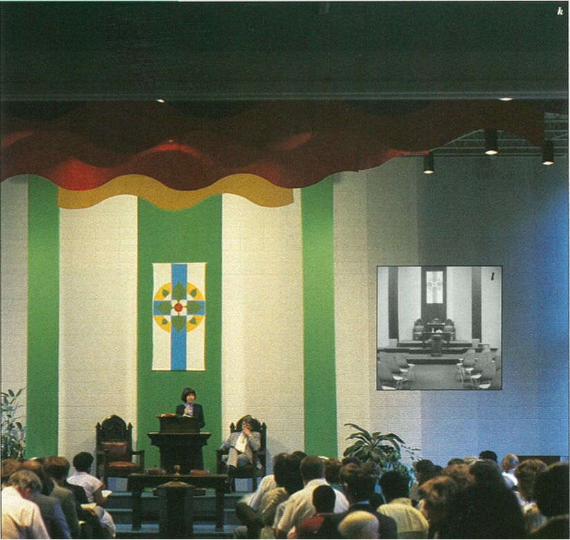
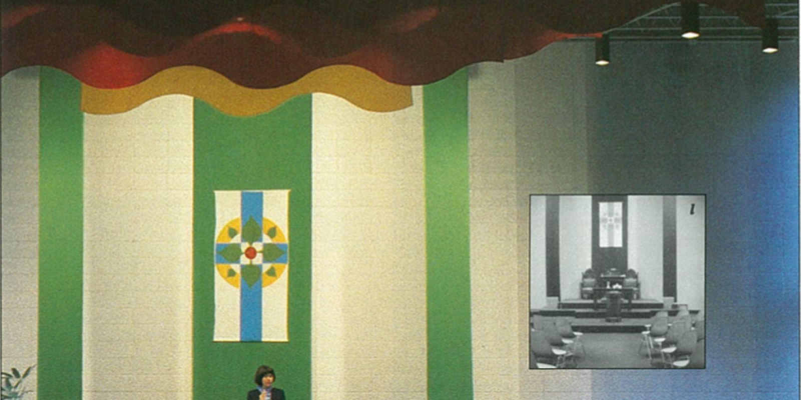
In 1978 we moved into a new sanctuary, a simple cement-block walled
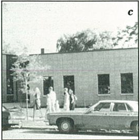
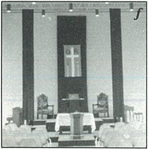
structure with a steel-girder roof. No pews or stained-glass windows were included in the plans. We simply could not afford such luxuries. However, we soon discovered that felt banners weren't the answer to our "plainness" either. The same hangings that had looked so impressive in the old place were now dwarfed by the twenty-two-by-fifty-foot blank grey front wall. Even the stately old pulpit furniture, the oldest in the Grand Rapids area, looked lost and out of place. We needed to rethink our approach.
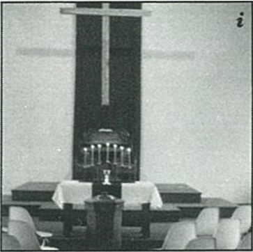
It was at that juncture—facing the reality of an annual budget for flowers and worship enhancement that never exceeded two hundred fifty dollars—that we discovered the impact of color. When a six-foot-wide single color hanging was installed behind the pulpit, flanked on each side by two very narrow hangings, it not only provided the needed liturgical focus but also changed the mood of the place, giving it a reflective, meditative environment.
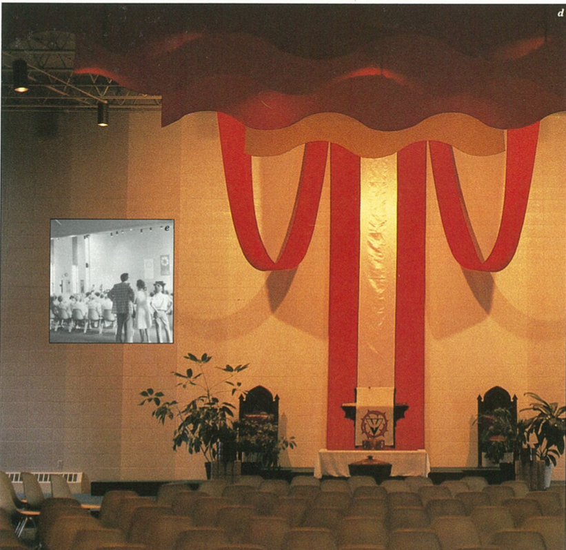
The success of these first purple hangings prompted us to experiment further. Soon the purple hangings were replaced by red, green, or blue hangings at the appropriate times of the church year.
The earlier banners, designed originally for the smaller space of the old sanctuary, were sometimes hung on the backdrop of the large hanging. In time, other materials were introduced. Images painted on styrofoam core board were employed on several occasions. And, during the 1985 Advent season, the banner was replaced by a brass-wire sculpture.
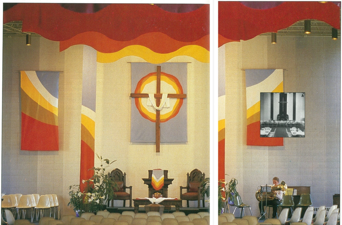
The ceiling banners were added later. At first we had ignored the steel-girder ceiling with its sagging insulation. But by installing the banners, we highlighted the ceiling, calling attention to the rainbow effect of the various colors.
The banners above us are now a constant reminder of God's faithfulness. Only during the periods of Lent and Advent do most of them come down.
We also altered the plain wall of grey cement block. Painting various grey stripes from the floor to the ceiling broke up the monotony of the even grey surface, giving the illusion of light and space.
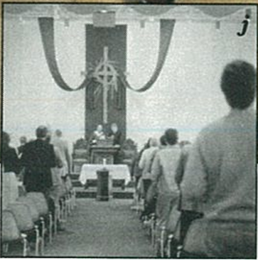
Versatility is one of the chief assets of Grace Church's worship place. All the hangings are flexible and can be changed within an hour's time without the use of ladders. The platforms of the liturgical center can also be moved to fit the needs of the service: They were constructed in sizes varying from two-by-four feet to four-by-eight feet. They also vary in height. Since we don't have pews, seating too is flexible. The stackable chairs can be arranged to fit the needs of the service. Sometimes we have two aisles, sometimes three. We have also worshiped in the round, in a semicircle, and around tables.
Grace Church's varied and worshipful environment has now become
part of our identity. What were financial restrictions in the construction of the new building have become a blessing for our congregation: the simplicity of the building has led us to be responsive to the various ways in which we worship God. From our initial emphasis on images on felt banners we have moved toward a serious consideration of a total visual organization of the worship space. The need to be flexible takes a little extra weekly effort, but by taking the time to work on the visual components of the worship space, we are learning to worship in a fitting environment.
HELP WANTED
Chris Overvoorde's article presents the potential for visual celebration in our worship space. The proper use of colors and design requires careful attention. We must draw upon the gifts of artists in our congregations to help plan the shapes, colors, and materials for our worship environment. Just as we honor the gifts and training of architects, acoustic specialists, and financial experts to guide us in our congregational decisions, so we should draw upon the gifts of artists in our churches. Some churches are fortunate in having artists in their congregations; others can use artist consultants (for example, from our colleges) to help in the design of their worship environment.